CountBio
Mathematical tools for natural sciences
Basic Statistics with R
QQ Plot
The Q-Q plot ("Quantile-Quantile plot") is a scatter plot between the quantiles of a data set and the corresponding quantile values from a
narmal(or any continuous) distribution.
For a data point $x_{i}$, the quantile $q_{i}$ is the fraction of data points whose values are less than $x_i$. In a data set, for example, if $40\%$ of the data points have value below 39.5, then 39.5 is the 0.4 quantile point of the data. If $70\%$ of the data points are below 89.6, then 89.6 is the 0.7 quantile of the data set.
If the data points are sampled from the normal distribution, we expect a linear correlation between the two variables plotted and expect them (ideally) to lie along a straight line. Considerable deviations from the straight line indicates that the data is not
sampled from the normal distribution (or from the continuous distribution compared).
To create the Q-Q plot of a given data, we order the data in ascending order and compute the quantiles of every data point $x_i$. We then compute
the same quantile points in the normal (or any continuous) distribution that we want to compare. The scatter plot between these two quantile vectors is the Q-Q plot.
We demonstrate this by simulating a data set in R.
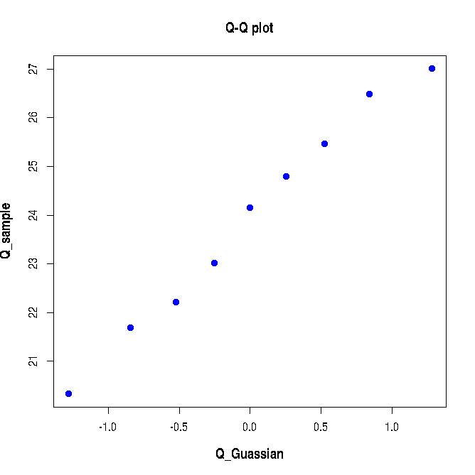
We first generate 20 random points from a normal distribution of mean=24 and standard deviation 3 to create a simulated data set X :
Next we compute the quantiles 0.1,0.2,0.3,0.4,0.5,0.6,0.7,0.8,0.9 and 1 of the above data X:X = rnorm(20, mean=24, sd=3)
Let us compute the same set of quantiles in the unit Gaussian doitribution:Q_sample = quantile(X, probs=seq(0.1,0.9,0.1))
The scatter plot between Q_sample and Q_Guassian generates the Q-Q plot:Q_Guassian = qnorm(seq(0.1, 0.9, 0.1))
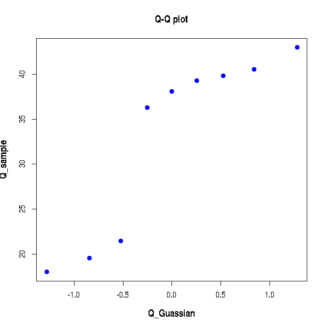
The following Q-Q plot is created: Since the data sampled from a Gaussi distribution is compared with that of Unit Gaussin distribution, the Q-Q plot in Figure-1 above almost lies along the diagonal line. We will now see how a bad Q-Q plot looks like. We will generate data from two different Gaussians and merge them to crete a non-normal data set and create a Q-Q plot for this data with Gaussian as reference. This is shown in the script lines below:plot(Q_Guassian, Q_sample, pch=19, col="blue",xlab="Q_Guassian", ylab="Q_sample", font.lab=2, cex.lab=1.2, main="Q-Q plot")
Executing the above lines of R-script creates the following plot: As expected, the above Q-Q plot does not show a linear correlation since the sample data points are not drawn from a gaussian distribution.X = c(rnorm(10, mean=20, sd=3), rnorm(20, mean=40, sd=3)) Q_sample = quantile(X, probs=seq(0.1,0.9,0.1)) Q_Gaussian = qnorm(seq(0.1, 0.9, 0.1)) plot(Q_Gaussian, Q_sample, pch=19, col="blue",xlab="Q_Guassian", ylab="Q_sample", font.lab=2, cex.lab=1.2, main="Q-Q plot")