CountBio
Mathematical tools for natural sciences
Biostatistics with R
Bar Charts
Bar charts (also called Bar plots) are useful for the quantitative comparison of a grouped data. A bar chart represents the data with rectangular bars such that the length of the bar is proportional to the values of the quantity they represent. The individual categoroes are represented as vertical or horizontal bars standing next to each other for quantitative comparison.
In R, the function barplot() is called for rendering a bar chart. This function can take a vector or a matrix of numbers as input.
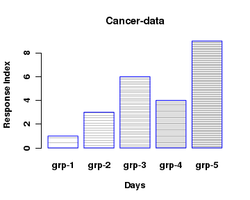
As an example, we will create a simple bar plot for comparing 5 values 1,2,6,4 and 9. The code and the resulting plot is given below:# Define a data vector data = c(1,3,6,4,9) #bar plot the vector -- simple plot with no legends and colors barplot(height=data, main="Cancer-data", xlab="Days", ylab="Response Index", names.arg=c("grp-1","grp-2","grp-3","grp-4","grp-5"), border="blue", density=c(10,20,30,40,50))
Some of the the important parameters of the function barplot() are:
 height   -----  either a vector of matrix of numbers describing the
                                                    bars in the plot

 names.arg  -----  a vector of names to be written below as labels for the bars.

 border  ----- the colour of the border around the bars

 density  ----- a vector of integers representing the number of
                     lines per inch on the bar as a shading.

 angle  ----- The slope of the shade lines, given as angle in degrees,
                         along counter-clockwise direction. Thus,
                          angle=0.0 draws horizontal lines inside bars as shade,
                          angle=45 draws crossed lines a shades and
                          angle = 90 draws vertical lines inside bars.

 col  -----  a vector of colors for the bars.


 beside  -----  logical value.
                       If FALSE, the columns of  height  are portrayed as
                         stacked bars (one on the top of other),
                         If TRUE, the columns are portrayed as bars standing next to each other.

Other parameters have the ususal meaning as in  plot()  function.

Type  help(barplot)  in R prompt to get details of other parameters.
Multiple comparisons in a bar plot
We can also make multiple comparisons in a bar plot. In the previous example, numbers in a vector were compared by a set of bars. Now if we pass a matrix made up of two or more vectors to the boxplot function, we can make multiple comparisons.
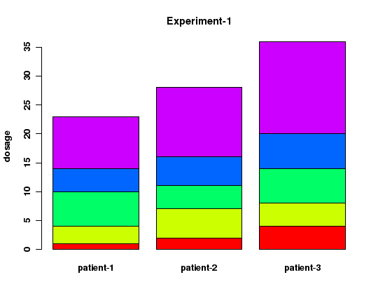
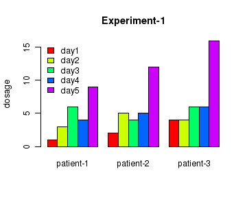
In the example below, we have a matrix of 3 vectors, each representing a set of 5 data points. We compare the 3 sets using bar plots. The three vectors represent three patients. In each vector, the 5 numbers represent the dosages of medicine given to the patients on 5 days. See the code here and the figure that follows:
# Create a data frame
col1 <- c(1,3,6,4,9)
col2 <- c(2,5,4,5,12)
col3 <- c(4,4,6,6,16)

data <- data.frame(col1,col2,col3)
names(data) <- c("patient-1","patient-2","patient-3")

# barplot with colors. Make sure that the plot and legends have same colors for items.
barplot(height=as.matrix(data), main="Experiment-1", ylab="dosage", beside=TRUE,
                                                            col=rainbow(5))

#Add legends
legend("topleft", c("day1","day2","day3","day4","day5"), cex=1.0, bty="n",
                                                             fill=rainbow(5))
The same data, when plotted with parameter value beside=FALSE looks like the one below: