CountBio
Mathematical tools for natural sciences
Biostatistics with R
2D scatter plots
A scatter plot is used for displaying the values of two variables in a data set. It is useful for visualizing the relationship between the two variables as well as the clustering of the data points. The 2D scatter plot is same as the plots with points. We just have to pass X and Y vectors for the two coordinates to the plot function as arguments. All other settings are similar.
In the code below, we create two data sets and create a scatter plot between them. We also label the individual data points for identifying various groupings in the data:
Xdata = c(2.1, 10.5, 4.2, 15.3, 13.6, 19.3, 5.6, 3.2, 12.6, 3.8, 14.1,  1.6,
                 19.6, 23.4, 24.0, 3.0, 23.0, 22.5, 22.0, 24.9, 23.0 )

Ydata = c(1.9, 11.4, 4.7, 16.2, 13.2, 18.9, 5.4, 2.9, 12.4, 21.0, 5.0, 23.1,
                  4.1, 2.6, 3.2, 20.0, 4.1, 24.5, 21.0, 24.0, 23.0  )

plot(Xdata,Ydata, pch=16, col="blue", cex = 0.6)

clabs = paste("p",seq(1,21), sep="")

text(Xdata+0.8, Ydata-0.5, clabs, col="black", cex=0.6,font=1)
The resulting scatter plot is shown below:
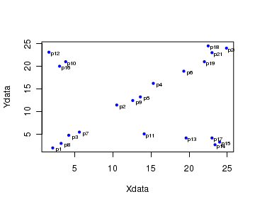
In the above plot, we can identify three distinct groups of data points:

(i) Points labelled  p10,p12,p16  have low Xdata value and high Ydata value.

(ii) Points labelled  p11, p13, p14, p15, p17  have high Xdata value and low Ydata value.

(ii) The remaining points approximately display a straight line relationship between the variables Xvalue and Yvalue.
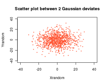
As a second example, we study the scatter plot between two variables which are points randomly drawn from a unit Guassian (unit normal) distribution.(These data points randomly drawn from a Gaussian distribution are called Gaussian deviates).
The R library function call rnorm(n) returns a vector of n random deviates drawn from a unit normal distribution.
If we plot a scatter plot between these two sets of random Gaussian deviates, they will be densely present near the center. As we go away from center, the density of points decreases. The code is given below along with the scatter plot:
# Generate 1000 random numbers from unit gaussian distribution
Xrandom = 10*rnorm(1000)

# Generate 1000 numbers from unit Gaussian
Yrandom = 10*rnorm(1000)

# plot the scatter plot. We choose color in Hexadecimal system
plot(Xrandom, Yrandom, cex=0.2, col="#FF5533", main="Scatter plot between 2
                    Gaussian deviates", xlim=c(-40,40), ylim=c(-40,40))